

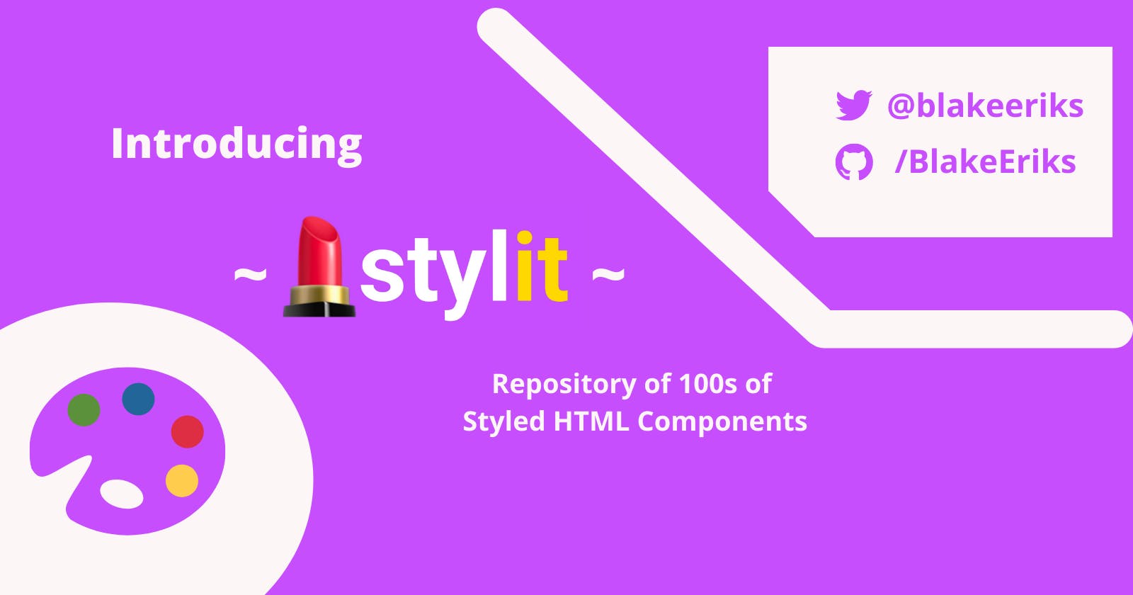


#Netlify #NetlifyHackathon
Hey guys! 👋🏼
Today (Jan 29th, 2022) I graduated from my Software Engineering bootcamp with General Assembly! I’m proud of the work I’ve put in the last 6 months, and stoked to see the progress I’ve made. I recommend bootcamping to anyone looking to improve their dev skills, especially on a short timeline. When there’s money attached to the outcome, we put more weight on seeing it through - as opposed to self-teaching. With graduating came the presentation of the project I’ve worked on for the last three weeks...
💄stylit!
Stylit is an interactive repository of styled HTML elements and a component editor all in one! I created it as a service for developers to...
💭 Find stylistic inspiration for their projects and
🎨 Experiment with styling components using a graphical editor
🤔 Background
In past projects, I have been quick to wiring things up and implement desired functionality, but consistently encountered mental blocks when designing the presentation (UI). Styling is still a newer skill for me, and I wanted to see if I could provide developers in a similar position a means of sparking creativity. This became the primary motivation for this platform, and I’m excited to see what gets created.
🔔 Features
Draft Editor
The draft editor is where stylit users can go to create, save and publish their component drafts.
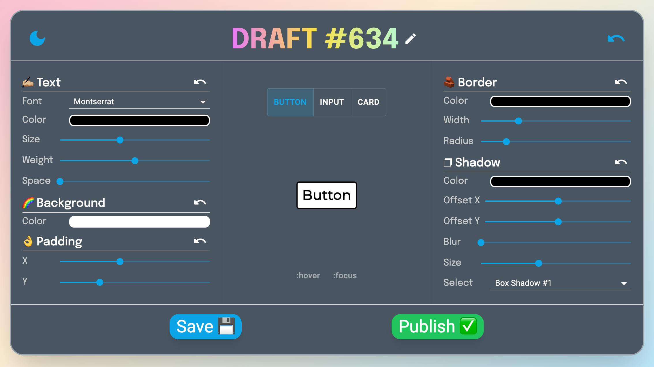
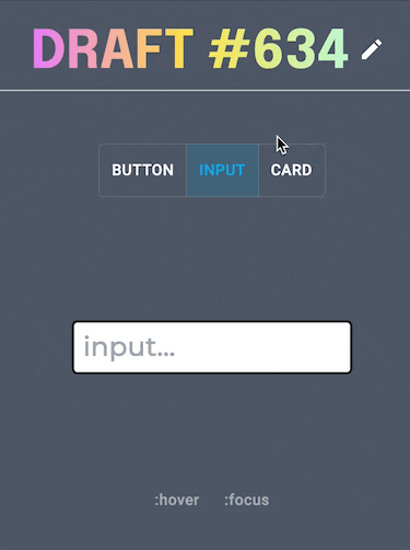
Currently, 💄stylit supports three different component types → buttons, inputs, and cards. This is likely to grow in the future.
The draft editor lets users edit many of the properties available using CSS. This includes the text, background, padding, border, and shadow(s).
Furthermore, the user can edit styles for the hover and focus pseudo-selectors. This is done by selecting the appropriate selector located beneath the component display.
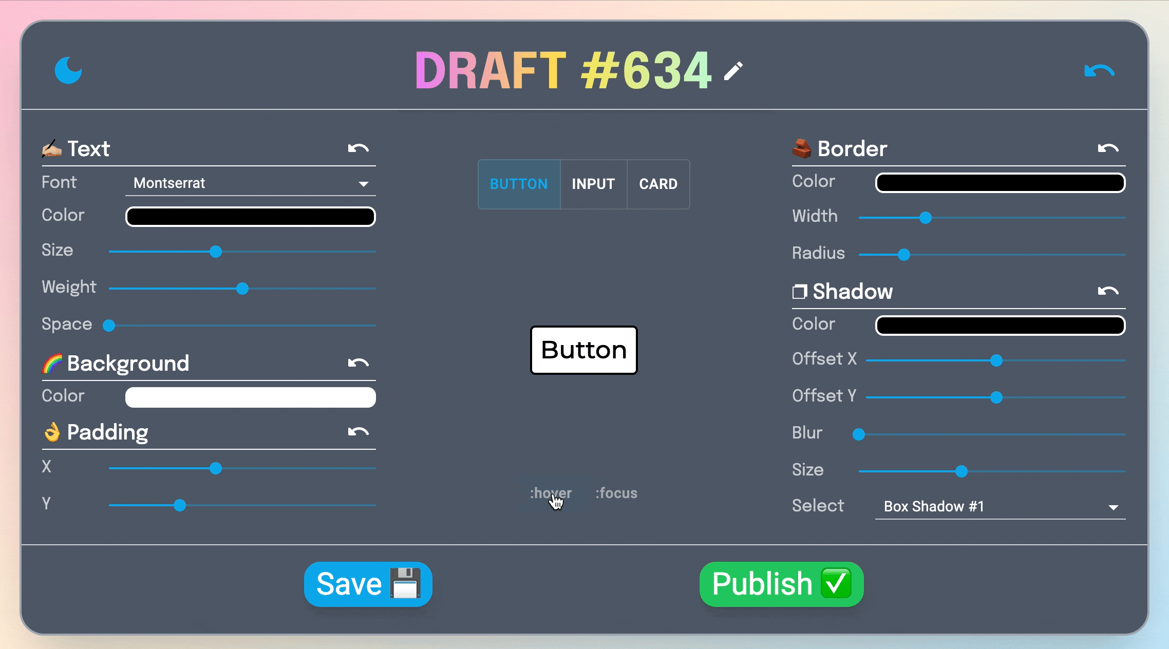
Adjacent to the draft editor (position depending on the viewport width), is the draft selector. This allows users to select between their saved drafts, as well as create new ones.
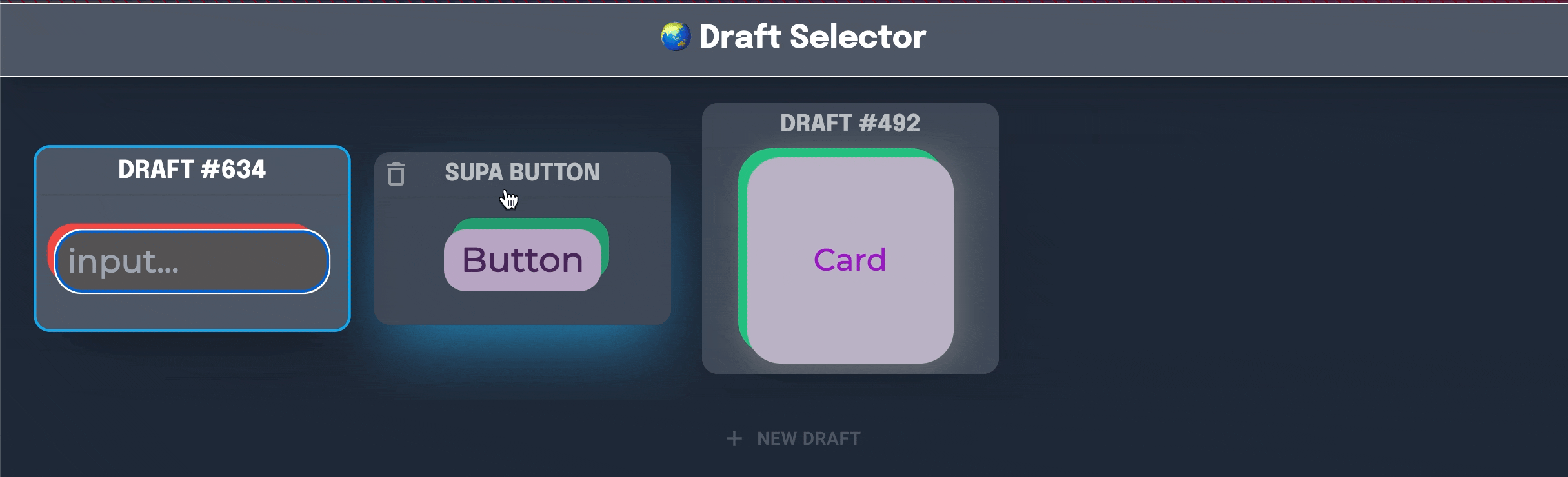
With so much customization, and more coming down the pipeline, the creative possibilities are truly endless.
Component Explorer
The component explorer is where stylit users go to check out all of the component creations! Each of the components has several interactions, including:
- Liking the component
- Starring the component
- Copying the component styles
Liking the component will increase its position in the popularity sort mode. Starring a component will save it to a user’s “starred” page. Lastly, users can copy the styles to the clipboard and paste them into their own applications!

The component explorer allows filtering by component type between the three available. These components can be sorted by popularity as well as creation date (ascending or descending). Lastly, the component explorer can toggle between light mode and dark mode.

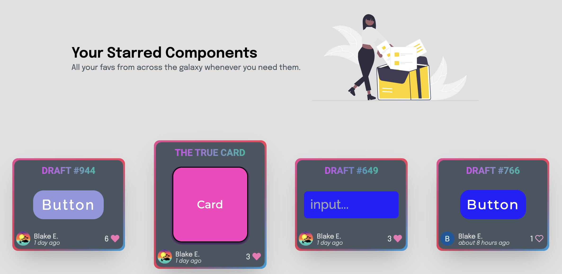
⭐️ Starred Components
The starred page lets a user review all of the components they have starred (and remove any if they like)
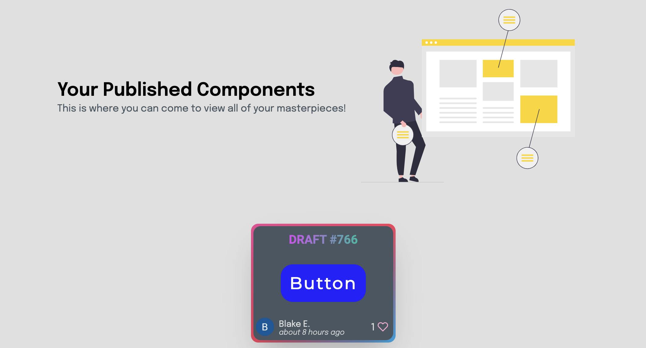
🎬 Published Components
The published page allows users to view all of their previously published components.
📡 Tools & Technologies
- NextJS SSR + builtin express server
- TypeScript Typed JavaScript
- Mongo Cloud: Cloud Database-as-a-Service
- Tailwind: easy drop in styles
- Emotion: inline pseudo-selector styles
- lodash: utility functions
- react-icons clean icons
- recoil state between components
- react-color color picker
- react-hot-toast: action notifications
- firebase: user auth
- date-fns: date distancing
- Material UI: helpful, clean components
- Animate.css: drop in css animations
- AOS: scroll animations
- Netlify: for hosting
👷 Challenges
Editing specific fragments of a box-shadow style.
Box-shadow styles in CSS take the following form
box-shadow: 0px 0px 0px 0px rgba(0,0,0,1),0px 0px 0px 0px rgba(0,0,0,1), ...,
This is assuming you want to manipulate the opacity of the shadow (using rgba instead of hex colors). This, however, adds complexity when splitting the box-shadow into its component parts, as one can no longer split based on a comma delimiter.
✅ Solution
This specific challenge was solved using a regex delimiter instead of trying to use a lone comma. The regex is /,(?![^\(]*\))/ which selects only commas that come after a pair of closing parentheses.
Applying inline styles that use pseudo-selectors.
Using normal html tags, one cannot apply pseudo-selectors within the style property. I needed to be able to do this in order to apply the dynamic styles being generated from the component editor.
✅ Solution
This problem was solved by using a third party styling library → emotion/react. This allows us to provide a css property to the components, wherein we include the pseudo-selectors as keys in the form &:hover.
Structuring component data when the properties change following a “publish”
Using TypeScript in this project required specifying the data types of all of the variables being used. This created a problem when using one interface for the component type, as following the publishing of said component, it would acquire the fields likes, _id, creator, and created_at.
Furthermore, our stylesmap property needed to be present on the interface, however with different sets of allows keys. The component pre-published (draft) was structured as an object mapping component state to styles, each index representing a different pseudo-selector. ie stylesMap[0] is normal styles, stylesMap[1] is :focus styles etc.
stylesMap: {[index in ComponentState]: Styles}
The component post-publishing took the following form.
stylesMap: { [index in ('&:hover' | '&:focus')]: Styles | keyof Styles }
This is how the data needed to be handed to the css tag with emotion/react.
✅ Solution
To accommodate for this structure change, we used a nice feature of TypeScript in its inheritance. Here’s how the data was interfaced.
// Interface to define our Component model
interface Component {
  name: string
  type: ComponentType
}

export interface DraftComponent extends Component {
  stylesMap: {[index in ComponentState]: Styles}
}

export interface PublishedComponent extends Component {
  _id: string
  likes: number
  stylesMap: { [index in ('&:hover' | '&:focus')]: Styles | keyof Styles }
  creator: User
  createdAt: number
}
This solution was much better than one interface for all cases with lots of conditional fields, and preserved our type safety!
🔭 What’s Planned
- Enriching the component editor
- Gradient background colors
- Editable input placeholder text
- Inset options for shadows
- Dark mode options for components
- Community
- Profile pages (check out other users’ published components)
- Explorer
- Filter by color profile
🎁 Wrapping Up
If you made it this far, I appreciate you for taking the time. I’m always looking for feedback on my work, and if you have the time to give stylit a try, I would love to hear your thoughts. You can find me at the following places: